Building identities for cities is always a complex challenge, especially when each territory carries its own symbols, histories, and deeply rooted emotions.
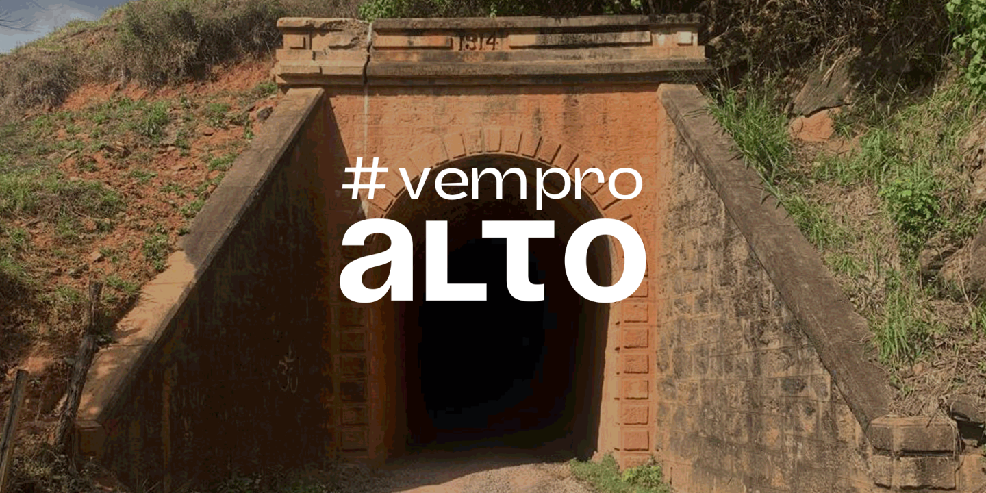
In the case of Alto Jequitibá, the challenge was to bring together, within a single brand, all the elements that represent the city: coffee, the jequitibá tree, the historic tunnel, and Pico da Bandeira. All of these needed to coexist consistently with the chosen typography, while still allowing for the creation of new icons in the future.
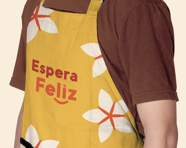
For Espera Feliz, the challenge was different: to highlight what truly sets the city apart within the Caparaó Region — its joyful essence, which makes “feliz” more than just a name, but a local feeling. In addition, it was essential to include a distinctive territorial element: Caparaó Yellow Coffee, a regional reference.
Despite their differences, both challenges shared a common goal: to transform territorial identity into a living, recognizable, and emotionally engaging visual narrative.
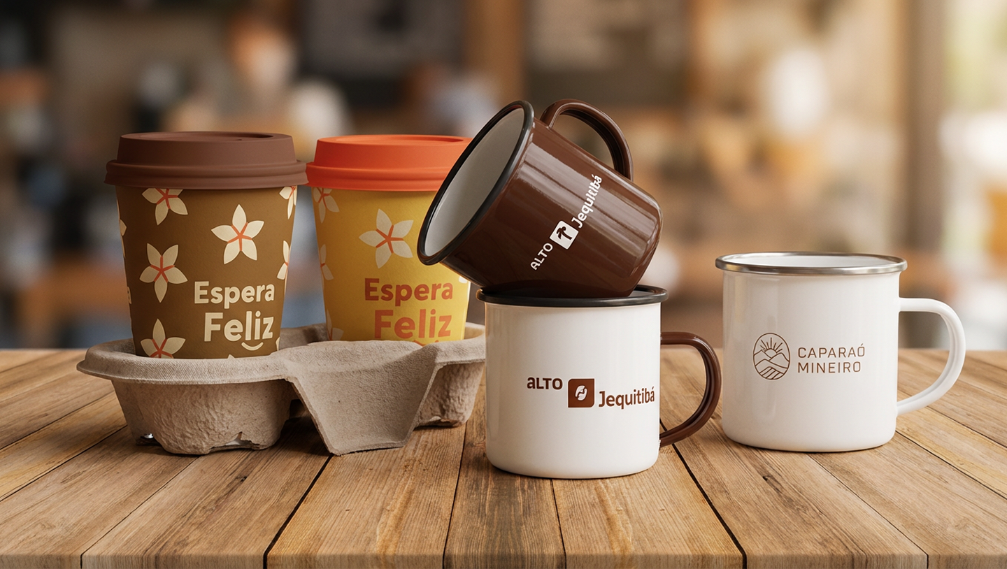
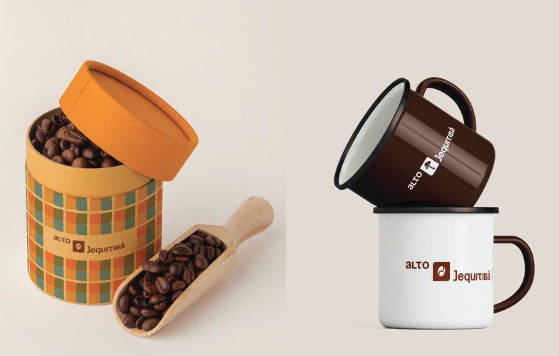
For Alto Jequitibá, we developed a mutable brand, with a fixed structure that can be customized according to the icons representing the city. We created not only an illustrated version, but also a logotype-only version designed for specific applications such as giveaways and audiovisual materials.
The icons emerged from the brand’s own typography, creating a coherent and infinite visual system and opening space for new symbols to be added over time.
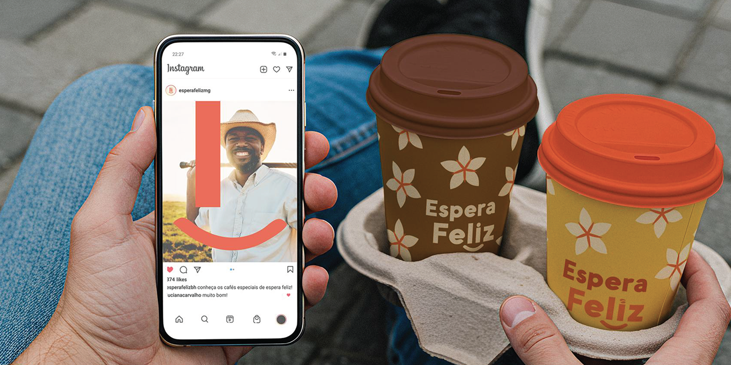
For Espera Feliz, the solution was to create a logo that literally smiles — a visual representation inspired by the landscape of Pico da Bandeira and Pico do Cristal. Coffee appears as the “dot” in the word “feliz,” integrating the regional element in a subtle, modern, and emotional way.
In both projects, the approach was guided by the same philosophy: living brands that translate the territory not just as a place, but as an experience.
The result was the creation of two distinct yet equally powerful identities:
Alto Jequitibá gained a flexible, symbolic, and adaptable brand, capable of representing the city’s diversity without losing visual unity.
Espera Feliz now features an affectionate and light identity that reinforces its emotional differentiation while also celebrating the coffee that drives the region.
Both cities now have brands that speak to their people, strengthen tourism, and create new communication opportunities — from institutional to promotional.